
css伪类样式效果合集
文字添加前置后置样式
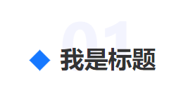
效果图如下
1 | .name{ |
进阶
修改伪类content内容
html
1
<div class="name" data-content-after=":after">我是标题</div>
css
1
2
3
4
5
6
7
8
9
.name::after {
position:absolute;
+ content: attr(data-content-after);
color: #F3F4FE;
font-size: 90px;
left: 0;
z-index: -1;
bottom: -19px;
}js
1
2
3
4
5
6
7
8
9
// 单个修改
$('.name').attr('data-content-after', '测试')
// 列表循环动态修改伪类中的值
let i = 0
$('.parent-div').each(() => {
i++
$('.name'+i).attr('data-content-after','0'+i)
})
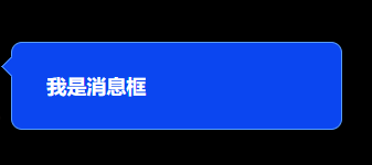
消息框
方法一:效果图
1 | .message-box { |
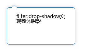
方法二:伪元素+border实现+整体阴影
效果图
1 | <div class="pop-with-border"> |
1 | .pop-with-border { |
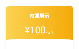
弧形卡片
内弧
效果图
代码
1
2
3<div class="card">
<div class="head"></div>
</div>1
2
3
4
5
6
7
8
9
10
11
12
13
14
15
16
17
18
19
20
21
22
23
24
25
26.card {
height: 466px;
background: #FFFFFF;
box-shadow: 0px 2px 10px 0px rgba(0,123,255,0.18);
border-radius: 10px;
}
/* 关键代码 */
.head {
position: relative;
height: 142px;
width: 270px;
color: #fff;
text-align: center;
border-radius: 10px 10px 0 0;
background: linear-gradient(270deg, #F5AA07 0%, #FBD353 100%);
}
.head::after{
content: '';
position: absolute;
background: #fff;
height: 8px;
border-radius: 50% 50% 0 0;
bottom: 0;
left: 0;
width: 100%;
}
外弧
效果图
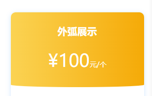
代码区别部分
1
2
3
4
5
6
7
8
9
10.head::after{
content: '';
position: absolute;
+ background: linear-gradient(270deg, #F5AA07 0%, #FBD353 100%);
+ height: 10px;
+ border-radius: 0 0 50% 50%;
+ bottom: -10px;
left: 0;
width: 100%;
}
弧形背景
效果图
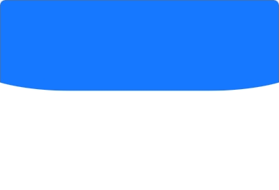
1 | <!-- html --> |
1 | // css |
本博客所有文章除特别声明外,均采用 CC BY-NC-SA 4.0 许可协议。转载请注明来自 Gardennias!
 微信/wechat
 支付宝/alipay
评论